Table of Contents
show
Visualization
- Visualization is important, as it allows one to see trends and patterns in the data
- Process of understanding how the variables in the dataset relate each other and their relationships are termed as statistical analysis
Python seaborn Functions
Visualizing Statistical Relationships
- Process of understanding relationships between variables of a dataset
Plotting with Categorical data
- Main variables is further divided into discrete groups
Visualizing the distribution of a dataset
- Understanding the datasets with context of being univariate or bivariate
import seaborn as sns
import matplotlib.pyplot as plt
import pandas as pd
data = pd.read_csv("F:/Advanced Python/Module - 3/Dataset/iris.csv")
data| Sepal Length | Sepal Width | Petal Length | Petal Width | Class | |
| 0 | 5.1 | 3.5 | 1.4 | 0.2 | Iris-setosa |
| 1 | 4.9 | 3 | 1.4 | 0.2 | Iris-setosa |
| 2 | 4.7 | 3.2 | 1.3 | 0.2 | Iris-setosa |
| 3 | 4.6 | 3.1 | 1.5 | 0.2 | Iris-setosa |
| 4 | 5 | 3.6 | 1.4 | 0.2 | Iris-setosa |
| … | … | … | … | … | … |
| 145 | 6.7 | 3 | 5.2 | 2.3 | Iris-virginica |
| 146 | 6.3 | 2.5 | 5 | 1.9 | Iris-virginica |
| 147 | 6.5 | 3 | 5.2 | 2 | Iris-virginica |
| 148 | 6.2 | 3.4 | 5.4 | 2.3 | Iris-virginica |
| 149 | 5.9 | 3 | 5.1 | 1.8 | Iris-virginica |
Distribution of Numerical Variable
distplot
- Histograms show the distribution of a single numerical variable
kdeplot
- Shows an estimated smooth distribution of a single numerical variable (or two numerical variables)
jointplot
- A jointplot comprises three plots. Out of the three, one plot displays a bivariate graph which shows how the dependent variable (Y) varies with the independent variable (X)
- Another plot is placed horizontally at the top of the bivariate graph and it shows the distribution of the independent variable (X)
- The third plot is placed on the right margin of the bivariate graph with the orientation set to vertical and it shows the distribution of the dependent variable (Y)
pairplot
distplot()
- A distplot plots a univariate distribution of observations
- It combines matplotlib hist function with the seaborn kdeplot() and rugplot() function
Parameter:
- a: Series, 1d-array or list (most essential parameter)
- Many more parameters are there
sns.distplot(data.loc[(data['Class']=='Iris-virginica'),'Sepal Length'])<matplotlib.axes._subplots.AxesSubplot at 0x1eef901dc70>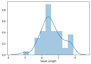
kdeplot
- Kernel Density Estimate is used for visualizing the probability density of a continuous variable.
- It depicts the probability density at different values in a continuous variable
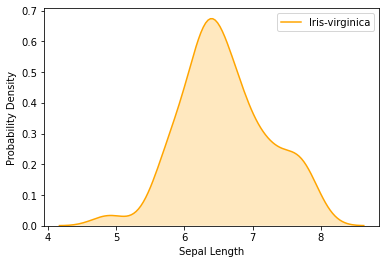
sns.kdeplot(data.loc[(data['Class']=='Iris-virginica'),'Sepal Length'],color = 'orange',shade = True, Label = 'Iris-virginica')
plt.xlabel('Sepal Length')
plt.ylabel('Probability Density')
Text(0, 0.5, 'Probability Density')data.loc[(data[‘Class’]==’Iris-virginica’),’Sepal Length’] – Extracts the column Sepal Length for the class Iris-virginica
jointplot
sns.jointplot(x=data["Sepal Length"],y=data["Petal Length"])
<seaborn.axisgrid.JointGrid at 0x1eefdd248b0>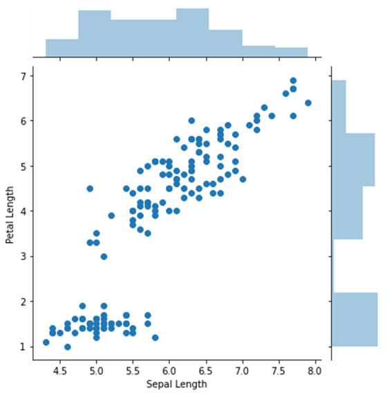
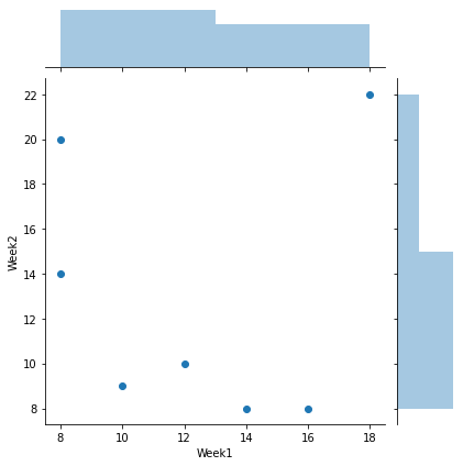
#For Better Understanding
import numpy as np
sales = pd.DataFrame({'Days':['Monday','Tuesday','Wednesday','Thursday','Friday','Saturday','Sunday'],
                     'Week1':[12,16,8,10,14,8,18],
                     'Week2':[10,8,14,9,8,20,22]}
                    )
sns.jointplot(x=sales['Week1'], y = sales['Week2'])
<seaborn.axisgrid.JointGrid at 0x1eefe0b6f40>pairplot
- A pairplot plot a pairwise relationships in a dataset
- The pairplot function creates a grid of Axes such that each variable in data will be shared in the y axis across a single row and in the x-axis across a single column
sns.pairplot(data) #drawing pair plot for all numerical columns
sns.pairplot(data,vars=['Sepal Length','Sepal Width']) #drawing pair plot only for column in the list mentioned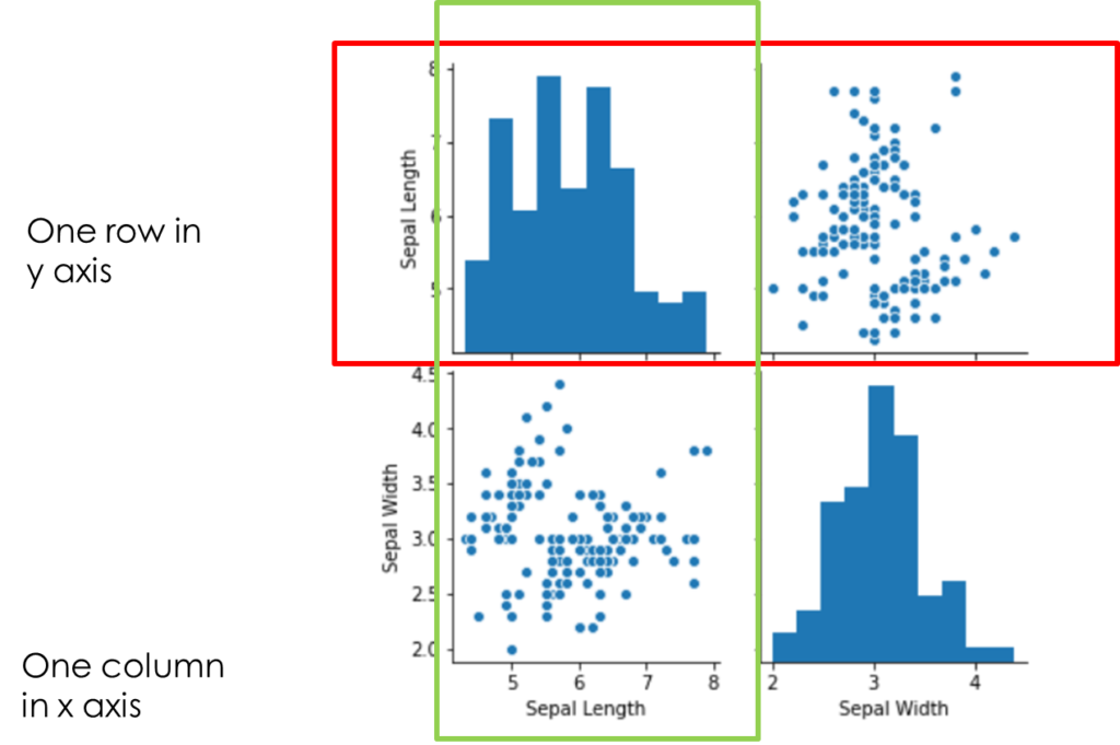
Plotting categorical plots
data1 = pd.read_csv("F:/Advanced Python/Module - 3/Dataset/tips.csv")
data1| total_bill | tip | sex | smoker | day | time | size | |
| 0 | 16.99 | 1.01 | Female | No | Sun | Dinner | 2 |
| 1 | 10.34 | 1.66 | Male | No | Sun | Dinner | 3 |
| 2 | 21.01 | 3.5 | Male | No | Sun | Dinner | 3 |
| 3 | 23.68 | 3.31 | Male | No | Sun | Dinner | 2 |
| 4 | 24.59 | 3.61 | Female | No | Sun | Dinner | 4 |
| … | … | … | … | … | … | … | … |
| 239 | 29.03 | 5.92 | Male | No | Sat | Dinner | 3 |
| 240 | 27.18 | 2 | Female | Yes | Sat | Dinner | 2 |
| 241 | 22.67 | 2 | Male | Yes | Sat | Dinner | 2 |
| 242 | 17.82 | 1.75 | Male | No | Sat | Dinner | 2 |
| 243 | 18.78 | 3 | Female | No | Thur | Dinner | 2 |
Categorical Scatterplots
- stripplot() ➡ (with kind = “strip”; the default)
- swarmplot() ➡ (with kind=“swarm”)
Categorical distribution plots
- boxplot() ➡ (with kind=“box”)
- violinplot() ➡ (with kind = “violin”)
- boxenplot() ➡ (with kind = “boxen”)
Categorical estimate plots
- pointplot() ➡ (with kind = “point”)
- barplot() ➡ (with kind = “bar”)
- countplot() ➡ (with kind = “count”)
stripplot()
- Plot between one categorical and one numerical variable
- Plot the points in strips that denote each category
sns.stripplot(x=data1['day'],y=data1['total_bill'])For each day, bill amount is marked in y axis

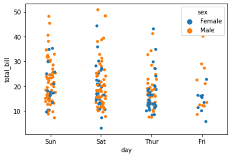
sns.stripplot(x=data1['day'],y=data1['total_bill'],hue=data1['sex'])Based on the third variable hue=data1[‘sex’]
swarmplot()
- Reduce too much overlapping caused by stripplot()
- swarmplot is otherwise termed to be bee swarm plot
sns.swarmplot(x=data1['day'],y=data1['total_bill'])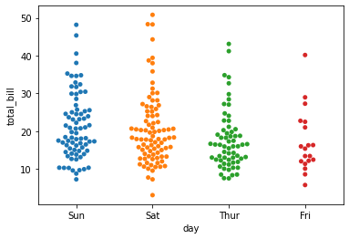
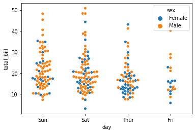
sns.swarmplot(x=data1['day'],y=data1['total_bill'],hue=data1['sex'])boxplot()
Works in the same way as boxplot() in matplotlib
sns.boxplot(x=data1['day'],y=data1['tip'])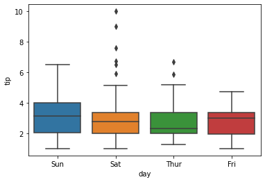
violinplot()
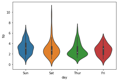
- Violin plots are used when there is a need to observe the distribution of numeric data
- Particularly useful when to make a comparison of distribution between multiple groupds
sns.violinplot(x=data1['day'],y=data1['tip'])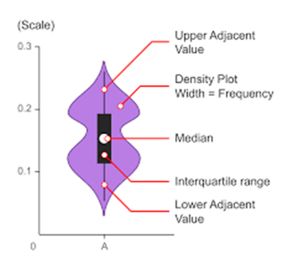
countplot()
Show value counts for a single categorical variable
sns.countplot(x=data1['sex'])
sns.countplot(x=data1['sex'])
sns.despine()
To count the instances based on sex and smoker i.e display for each sex how many smoker and non smoker are there
data1.sex.value_counts()Male 157
Female 87
Name: sex, dtype: int64sns.countplot(x=data1['sex'],hue=data1['smoker'])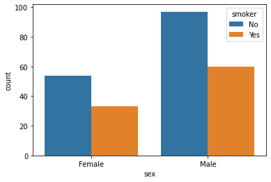
barplot()
Used to draw a barplot. A barplot represents an estimate of central tendency for a numeric variable with the height of each rectangle and provides some indication of the uncertainty around that estimate using error bars
sns.barplot(x=data1['sex'], y=data1['tip'])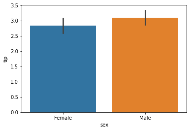
sns.barplot(x='sex', y='tip',data = data1,hue=data1['smoker'])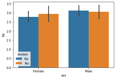
Views: 6