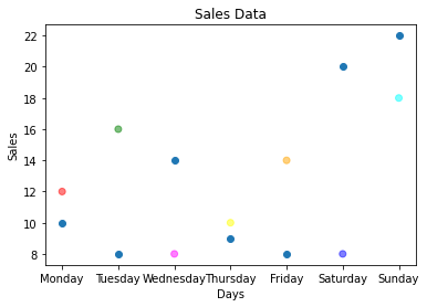
scatter() function plots one dot for each observation
Needs two arrays of same length for the values of x-axis and one for value on yaxis
plt.scatter(x,y) // x and y represents the arrays of same lengthTo specify the color name of the plots
plt.scatter(x,y,color=‘colorname’)To change the size of the dots with the s argument. Array of sizes can alsoe be passed
plt.scatter(x,y,size=sz)Where sz is the array of numbers that depicts the size of each observation
To adjust the transparency of the dots use alpha argument
plt.scatter(x,y,alpha=0.5)The sale of electric bulb on different days of a week is shown below
| days | number of electric bulbs (Week 1) | number of electric bulbs (Week 2) |
|---|---|---|
| Monday | 12 | 10 |
| Tuesday | 16 | 8 |
| Wednesday | 8 | 14 |
| Thursday | 10 | 9 |
| Friday | 14 | 8 |
| Saturday | 8 | 20 |
| Sunday | 18 | 22 |
- a) Represent the above data with the help of scatter plot for week1 and week2 on same plot
- b) Give the label for x as days and y as sales
- c) Give separate color for scatter of week 1 data
- d) set the transparency of observation to 0.5 for scatter of week 1 data
import matplotlib.pyplot as plt
import pandas as pd
sales = pd.DataFrame({'Days':['Monday','Tuesday','Wednesday','Thursday','Friday','Saturday','Sunday'],
                     'Week1':[12,16,8,10,14,8,18],
                     'Week2':[10,8,14,9,8,20,22]}
                    )
colors = np.array(['red','green','magenta','yellow','orange','blue','cyan'])
plt.scatter(sales['Days'],sales['Week1'],c=colors,alpha=0.5)
plt.scatter(sales['Days'],sales['Week2'])
plt.xlabel('Days')
plt.ylabel('Sales')
plt.title('Sales Data')
plt.plot()
Bar Chart
Intends to compare categorical data across one or two dimensions
The sale of electric bulb on different days of a week is shown below
| days | number of electric bulbs (Week 1) | number of electric bulbs (Week 2) |
|---|---|---|
| Monday | 12 | 10 |
| Tuesday | 16 | 8 |
| Wednesday | 8 | 14 |
| Thursday | 10 | 9 |
| Friday | 14 | 8 |
| Saturday | 8 | 20 |
| Sunday | 18 | 22 |
- a) Represent the above data with the help of bar plot for week1 and week2 as multi bar
- b) Give the label for x as days and y as sales
- c) Give separate color for scatter of week 1 data and week 2
- d) Set the width of the bar as 0.4
import matplotlib.pyplot as plt
import pandas as pd
sales = pd.DataFrame({'Days':['Monday','Tuesday','Wednesday','Thursday','Friday','Saturday','Sunday'],
                     'Week1':[12,16,8,10,14,8,18],
                     'Week2':[10,8,14,9,8,20,22]}
                    )
r = np.arange(7)
plt.bar(r-0.2,sales['Week1'],color='red',width=0.4)
plt.bar(r+0.2,sales['Week2'],color='blue',width=0.4)
plt.xticks(r,sales['Days'])
plt.show()
Histogram
- It is a graphical representation of a grouped frequency distribution with continuous classes
- It is an area diagram and can be defined as a set of rectangles with bases along with the intervals between class boundaries
- Used when the data is numerical
| Histogram | Bar Graph |
| The frequency is shown by the area of each rectangle | The height shows the frequency and width has no significance |
| It shows rectangles touching each other | It consists of rectangles separated from each other with equal spaces |
The life time of certain kind of bulb is given below
| Life Time | number of bulbs |
|---|---|
| 250 | 12 |
| 370 | 16 |
| 470 | 8 |
| 420 | 9 |
| 520 | 10 |
| 560 | 10 |
| 225 | 14 |
| 900 | 8 |
| 430 | 18 |
| 330 | 15 |
| 315 | 13 |
- a) Represent the above data with the help of Histogram: The data should be interpreted as how many bulbs are in the range of [200-300,300-400, 400-500, 500-600, 600-700, 700-800, 800-900, 900-1000]
- b) Give the label for x as days and y as sales
import matplotlib.pyplot as plt
import pandas as pd
l1 = [250,370,470,420,520,560,225,900,430,330,315]
l2 = [12,16,8,9,10,10,14,8,18,15,13]
bulb = pd.DataFrame({'Life Time':l1,'number of bulbs':l2}
                   )
plt.hist(bulb['Life Time'],bins=[200,300,400,500,600,700,800,900,1000])
plt.title("Result")
plt.xlabel('Life Time')
plt.ylabel('number of bulbs')
plt.show()

Pie Chart
- Pie chart draws one piece called wedge for each value in the array
- By default, the plotting of first wedge starts from x coordinate, and moves counter clock wise
- Size of each wedge is determined by comparing the value with all other values by using: x/ sum(x)
The daily sales (in rupees) of a bakery shop is shown as
| Items | Sales in Rupees |
|---|---|
| Biscuit | 40 |
| Wheat Bread | 20 |
| Fruit cake | 12 |
| choco cake | 9 |
| Honey cake | 13 |
- a) Represent the above data with the help of pie chart:
- b) Stand out the item which have maximum sales
- c) specify the colors for each item
- d) Show the legend
- e) start the wedge for an item in 90 degree
- f) Add the labels to each wedge
- g) set shadow for each wedge
import matplotlib.pyplot as plt
import pandas as pd
data1 = pd.DataFrame({'Items':['Biscuit','Wheat Bread','Fruit cake','choco cake','Honey cake'],
                     'Sales in Rupees':[40,20,12,9,13]})
plt.pie(data1['Sales in Rupees'],labels=data1['Items'],explode=[0.3,0,0,0,0], colors=['red','green','orange','yellow','cyan'],startangle=90, shadow=True)
plt.legend(loc='lower right')
plt.show()
Box plot
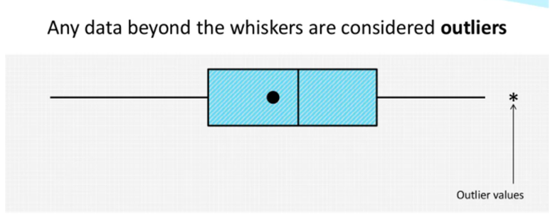
- A box plot is a graphical way that summarizes the important aspects of the distribution of numeric data
- Otherwise called as box and Whisker plot
- Box plot can be drawn either vertically or horizontally
- The length of the box plot indicates the spread of the data
- Useful when comparing between several datasets


- Ordered data are divided into a lower and an upper half by the median.
- The median of the lower half is the lower quartile.
- The median of the upper half is the upper quartile.
- The lower extreme is the least data value.
- The upper extreme is the greatest data value.

The sale of electric bulb on different days of a week is shown below
| days | number of electric bulbs (Week 1) | number of electric bulbs (Week 2) |
|---|---|---|
| Monday | 12 | 10 |
| Tuesday | 16 | 8 |
| Wednesday | 8 | 14 |
| Thursday | 10 | 9 |
| Friday | 14 | 8 |
| Saturday | 8 | 20 |
| Sunday | 18 | 22 |
- a) Represent the above data with the help of box plot for week1 and week2
- b) Give the label for x as Groups and y as Summary
import matplotlib.pyplot as plt
import pandas as pd
sales = pd.DataFrame({'Days':['Monday','Tuesday','Wednesday','Thursday','Friday','Saturday','Sunday'],
                     'Week1':[12,16,8,10,14,8,18],
                     'Week2':[10,8,14,9,8,20,22]}
                    )
plt.boxplot([sales['Week1'],sales['Week2']])

plt.xlabel("Groups")
plt.ylabel("Summary")
plt.show()
Views: 7