Table of Contents
show
Both series and DataFrame have a plot() method
Line Plot
X axis is not provided Pandas by default considered index as x axis
import pandas as pd
import matplotlib.pyplot as plt
data= pd.read_csv("F:/Advanced Python/Module - 3/Dataset/iris.csv")
data.plot(kind='line',
         y='Petal Length',
          figsize = (10,5),
          style='b-',
          title = " Petal Length"
         )
plt.show()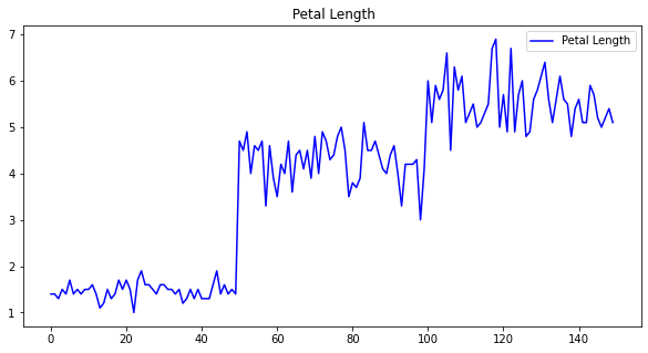
Plotting multiple lines
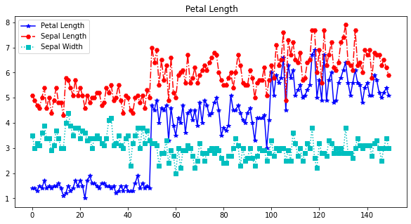
data.plot(kind='line',
         y=['Petal Length','Sepal Length','Sepal Width'],
          style=['b-*','r-.H','c:s'],
          figsize = (10,5),
          title = " Petal Length",
          label = ['Petal Length','Sepal Length','Sepal Width'] # label should be same length as of y
         )
plt.show()
# to visualize all the numerical columns in the dataset
data.plot(kind='line', subplots= True, layout=(2,2),
figsize=(10,5), title = "Visualization of Iris Data", sharex=False
)
plt.show()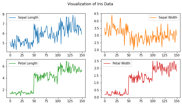
Scatter plot
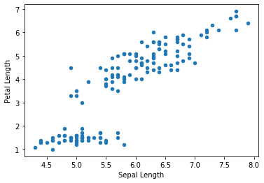
data.plot(kind='scatter',x='Sepal Length',y='Petal Length')
plt.show()
Heat Map
- Lets to visualize the correlation coefficients
- A heatmap is a matrix kind of 2-dimensional figure which gives a visualisation of numerical data in the form of cells.
- Each cell of the heatmap is coloured and the shades of colour represent some kind of relationship of the value with the dataframe
# generating pairwise correlation
corr1 = data.corr()
  # Displaying dataframe as an heatmap
# with diverging colourmap as coolwarm
corr1.style.background_gradient(cmap ='coolwarm')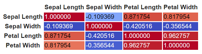
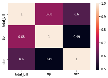
corr1 = data1.corr()
sns.heatmap(corr1, annot = True)
plt.show()
DataFrame.plt.functions
Area
DataFrame.plot.area(x=None, y=None)
- X, coordinates for the x axis. By default index
- Y coordinates for the y axis . (column)
Bar
DataFrame.plot.bar(x=None, y=None
- X:Allows plotting of one column versus another. If not specified, the index of the DataFrame is used.
- Y: Allows plotting of one column versus another. If not specified, all numerical columns are used.
Pie plot
- A pie plot is a proportional representation of the numerical data in a column.
- DataFrame.plot.pie(**kwargs)
- kwargs -> any keyword arguments
plot = df.plot.pie(y='mass', figsize=(5, 5))
plot = df.plot.pie(subplots=True, figsize=(10, 5))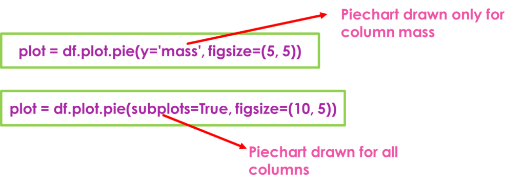
hist()
plt.style.use('ggplot')
data['Sepal Length'].hist()
plt.show()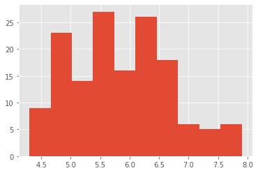
Views: 1