Plotting Curves
- Process of presenting data in the form of graphs or charts
- Helps to understand large and complex amounts of data very easily
Matplotlib:
- Matplotlib is a low-level library of python which is used for data visualization
- Matplotlib utilities presentd under the pyplot submodule and can be imported using the alias
Syntax
import matplotlib.pyplot as pltExample 1
Draw a line from position (0,0) to (10,100)
- Plot() function is used to draw points in a figure
- By default, it draws line from one point to other
This function takes the parameters as:
- Parameter 1: an array containing the points on x-axis
- Parameter 2: an array containing the points on y-axis
- To draw a line from (0,0 to (10,100:
- Create two arrays: X_array should have points in x axis and y_array should have points in y axus
- Here, x_array: 0, 10 Y_array: 0,100
.
import matplotlib.pyplot as pl
import numpy as np
x_axis= np.array([0,10]) # create x axis using array
y_axis = np.array([0,100])
pl.plot(x_axis,y_axis)
pl.show()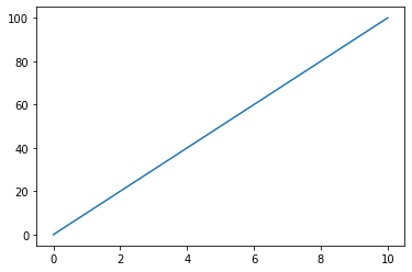
Plotting Without line
To plot only the markers
- A string like notation parameter ‘o’ can be used which means rings
Example: Draw two points in the diagram one at position (1,5) and one in (10,20)
.
import matplotlib.pyplot as pl
import numpy as np
x_axis= np.array([1,10]) # create x axis using array
y_axis = np.array([5,20])
pl.plot(x_axis,y_axis,'o')
pl.show()
Plotting Multiple points
Example 3: Draw a line from (1,3) (5,2),(8,9)
.
import matplotlib.pyplot as pl
import numpy as np
x_axis = np.array([1,5,8])
y_axis = np.array([3,2,9])
pl.plot(x_axis,y_axis)
pl.show()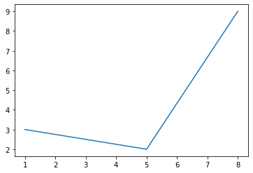
- If X axis is not provided, then default value of x is assigned till the length of the y axis.
- Default values of x start from 0
.
import matplotlib.pyplot as plt
import numpy as np
yaxis = np.array([5,1,4,8])
plt.plot(yaxis)
plt.show()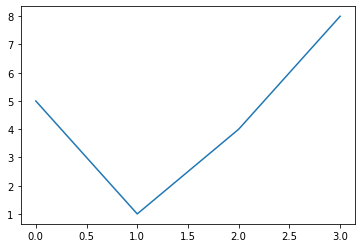
Markers
| Marker | Description |
| ‘o’ | Circle |
| ‘*’ | Star |
| ‘.’ | Point |
| ‘,’ | Pixel |
| ‘+’ | Plus |
| Marker | Description |
| ‘s’ | Square |
| ‘D’ | Diamond |
| ‘d’ | Pentagon |
| ‘H’ | Hexagon |
| ‘V’ | Triangle Down |
Line
The line value can be specified as:
| Line Syntax | Description |
| ‘-’ | Solid line |
| ‘:’ | Dotted line |
| ‘—’ | Dashed line |
| ‘-.’ | Dashed / dotted line |
Color
| Color Syntax | Description |
| ‘r’ | Red |
| ‘g’ | Green |
| ‘b’ | Blue |
| ‘c’ | Cyan |
| ‘m’ | Magenta |
| ‘y’ | Yellow |
| ‘k’ | Black |
| ‘white’ | White |
‘o:r’ à prints circle marker with dotted line in red color
Marker Size
- The keyword argument markersize can be specified
- It can also be specified as ms
Example
markersize = 20
(or)
ms= 20
Marker Edge color
- The keyword argument markeredgecolor can be used
- It can also be specified as mec
markeredgecolor = ‘r’
(or)
mec=‘r’
Marker Face color
- The keyword argument markerfacecolor can be specified
- It can also be specified as mfc
markerfacecolor = ‘r’
(or)
mfc=‘r’
Example
.
import matplotlib.pyplot as plt
import numpy as np
yaxis = np.array([5,1,4,8])
plt.plot(yaxis,'p:b',mec='r',mfc='g',ms=20)
plt.show()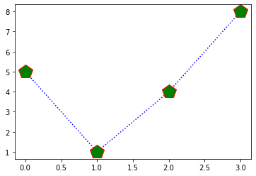
Line Style
- The keyword argument linestyle can be specified
- In short, it can be specified as ls
| Style | Alternate |
| ‘solid’ | ‘-’ |
| ‘dotted | ‘:’ |
| ‘dashed’ | ‘–’ |
| ‘dashdot’ | ‘-.’ |
Line Color
- The keyword argument color can be specified
- In short, it can be specified as c
.
color = ‘r’
(or)
c=‘r’
Line Width
- The keyword argument linewidth can be specified
- In short, lw can be specified
linewidth = 18.6
(or)
lw= 17
.
import matplotlib.pyplot as plt
import numpy as np
yaxis = np.array([5,1,4,8])
plt.plot(yaxis,ls='dashdot', c='hotpink', lw='5.5',marker='H',markeredgecolor='g')
plt.show()
Plotting Multiple Lines
- Include as many plot() functions
- One plot() function for each line
import matplotlib.pyplot as plt
import numpy as np
yaxis = np.array([5,1,4,8]) #dimension of yaxis and yaxis1 must be same
yaxis1 = np.array( [2,9,7,4])
plt.plot(yaxis)
plt.plot(yaxis1)
plt.show()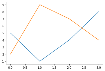
Alternately, include both x and y axis for each line in a single plot() function
import matplotlib.pyplot as plt
import numpy as np
x1 = np.array([2,3,7,4])
x2= np.array([2,3,7,4])
yaxis = np.array([5,1,4,8]) #dimension of yaxis and yaxis1 must be same
yaxis1 = np.array( [2,9,7,4])
plt.plot(x1,yaxis,x2,yaxis1,marker='s')
plt.show()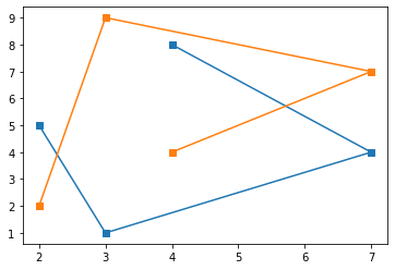
Labels, Title
Create Labels for a plot
Use xlabel() functions to set label for x axis
Use ylabel() functions to set label for y axis
Example
plt.xlabel(“Height”)
plt.ylabel(“Weight”)
Create title for a plot
Use title( ) function is used to set a title for the plot
.
Example
plt.title(“Height vs.Weight”)Font Properties
fontdict parameter in xlabel(), ylabel(), and titile() is used to set the font properties of title and labels
Position of the title
- Achieved by using loc parameter in title()
- Values taken by loc parameter are: ‘left;, ‘right’, and ‘center’
- Default value is ‘center’
legend()
- Gives explanation about each wedge (observation)
- It has the parameter loc
Which takes the values:
- upper right
- upper left
- lower left
- lower right
- right
- center left
- center right
- lower center
- upper center
- center
Example 8:
The following data gives the amount of loans (in crores) disbursed by a bank during some years
| year | Loan (in Crores) |
|---|---|
| 1992 | 28 |
| 1993 | 33 |
| 1994 | 55 |
| 1995 | 55 |
| 1996 | 80 |
- a) Represent the above data with the help of line graph
- b) Give the label for x as year and y as Loan (in crores) with font size as 15, color as blue and family as serif
- c) Represent the marker as square and size as 5.
- d) Also set the edge and face color of the marker as green and red respectively
- e) Give the title as Loan Disbursed in left with font size as 15, color as blue and family as serif
- f) The property of the line is dashed line with orange color
import matplotlib.pyplot as plt
import numpy as np
year = np.array([1992,1993,1994,1995,1996])
Loan = np.array([28,33,55,55,80])
plt.plot(year,Loan,marker="s",ms=5,mec="g", mfc='r',linestyle="dashed",c='orange')
font1 = {'family':'serif','color':'blue','fontsize':15}
plt.xlabel("Year",fontdict=font1)
plt.ylabel("Loan",fontdict=font1)
plt.title("Loan Disbursed",loc='left',fontdict=font1)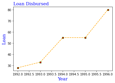
Grid
- grid() function is used to add grid lines to the plot
Syntax
plt.grid()Parameter axis is used to specify which grid lines to display
- Values taken by axis parameters are ‘x’, ‘y’ and ‘both. Default value is ‘both
Properties of the grid line
- Inside the grid() function:
- color=‘colorname’, linestyle=‘anylinestyle’,linewidth=number can be specified
import matplotlib.pyplot as plt
import numpy as np
a = np.array([20,30,40,50])
b= np.array([60.1, 45,34,67])
plt.plot(a,b)
plt.grid(axis='x',color = 'orange',linestyle='dashdot', linewidth=3.5)
plt.show()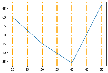
Subplot
- subplot() function takes three arguments that describes the layout of the figure
- The layout is organized in rows and columns, which are represented by first and second argument
- The third argument represents the index of the current plot
plt.subplot(1,2,1)
import matplotlib.pyplot as plt
import numpy as np
a = np.array([20,30,40,50])
b= np.array([60.1, 45,34,67])
x1 = np.array([2,3,7,4])
yaxis = np.array([5,1,4,8]) #dimension of yaxis and yaxis1 must be same

plt.subplot(1,2,1)
plt.plot(a,b,marker='s')
plt.subplot(1,2,2)
plt.plot(x1,yaxis,marker='s')
plt.show()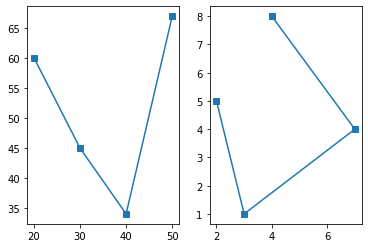
Creating Line graph for DataFrame
The sale of electric bulb on different days of a week is shown below
| days | number of electric bulbs |
|---|---|
| Monday | 12 |
| Tuesday | 16 |
| Wednesday | 8 |
| Thursday | 10 |
| Friday | 14 |
| Saturday | 8 |
| Sunday | 18 |
- a) Represent the above data with the help of line graph
- b) Give the label for x as days and y as sales
- c) Represent the marker as square and size as 5
- e) Give the title as Sales
import matplotlib.pyplot as plt
import pandas as pd
sales = pd.DataFrame({'Days':['Monday','Tuesday','Wednesday','Thursday','Friday','Saturday','Sunday'],
                     'Sales':[12,16,8,10,14,8,18],
                     'profit':[100,50,200,300,40,50,10]}
                    )
plt.plot(sales["Days"],sales["Sales"],markersize=5,marker='s')
plt.xlabel('Days')
plt.ylabel('Sales')
plt.title('Sales')
plt.show()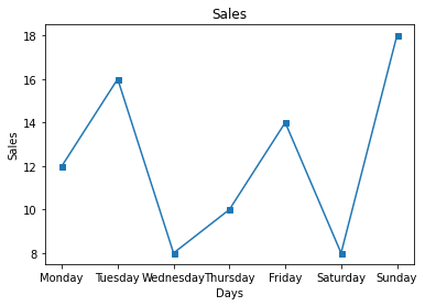
Views: 2