Table of Contents
show
Plotly and Cufflink
- Plotly is an open-source and charting library that provides the facility of interactive plotting
- Plotly charts are dynamic in nature which allows to hover over the values, zoom in, zoom out of graphs and identifies outliers in the dataset
- Cufflink is also a python library that connects plotly with pandas so that we can create charts directly on data frames. It acts as a plugin
Installation
plotly
conda install plotlyCollecting package metadata (current_repodata.json): ...working... done
Solving environment: ...working... done
Note: you may need to restart the kernel to use updated packages.## Package Plan ##
environment location: C:\Programme\Anaconda3
added / updated specs:
- plotly
The following packages will be SUPERSEDED by a higher-priority channel:
conda conda-forge::conda-4.12.0-py38haa244f~ --> pkgs/main::conda-4.12.0-py38haa95532_0
Preparing transaction: ...working... done
Verifying transaction: ...working... done
Executing transaction: ...working... doneCufflink
conda install -c conda-forge cufflinks-pyCollecting package metadata (current_repodata.json): ...working... done
Solving environment: ...working... done
## Package Plan ##
environment location: C:\Programme\Anaconda3
added / updated specs:
- cufflinks-py
Note: you may need to restart the kernel to use updated packages.
The following packages will be SUPERSEDED by a higher-priority channel:
conda pkgs/main::conda-4.12.0-py38haa95532_0 --> conda-forge::conda-4.12.0-py38haa244fe_0
Preparing transaction: ...working... done
Verifying transaction: ...working... done
Executing transaction: ...working... done
Importing plotly and cufflink
import plotly.offline as pl
import cufflinks as cf
import pandas as pd
from plotly.offline import iplot
cf.go_offline() #will make cufflinks offline
cf.set_config_file(offline=False, world_readable=True)
Histogram
To get the count of range of data
l1 = [250,370,470,420,520,560,225,900,430,330,315]
l2 = [12,16,8,9,10,10,14,8,18,15,13]
bulb = pd.DataFrame({'Life Time':l1,'number of bulbs':l2}
                   )
bulb['Life Time'].iplot(kind="histogram",theme="white",title="LifeTime of bulb",xTitle='LifeTime',yTitle='Count')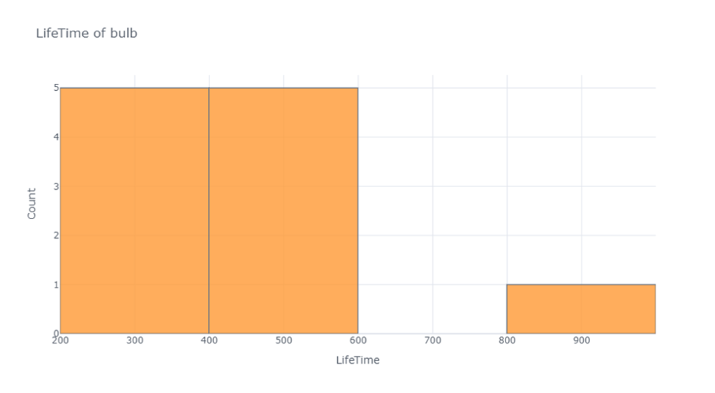

Heatmap
Often Heat map is used to print the correlation between variables
data= pd.read_csv("F:/SRIHER/2021-2022/Quarter - 3/Advanced Python/Module - 3/Dataset/tips.csv")
data.corr().iplot(kind='heatmap',colorscale="Blues",title="Feature Correlation Matrix")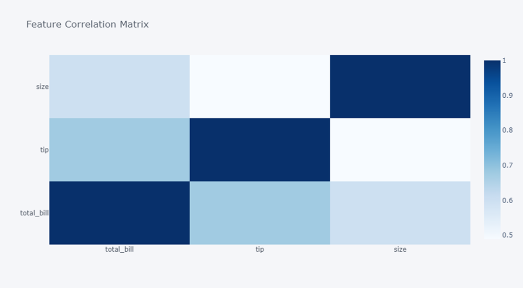

To Get Help
help(data.iplot)Help on method _iplot in module cufflinks.plotlytools:
_iplot(kind='scatter', data=None, layout=None, filename='', sharing=None, title='', xTitle='', yTitle='', zTitle='', theme=None, colors=None, colorscale=None, fill=False, width=None, dash='solid', mode='', interpolation='linear', symbol='circle', size=12, barmode='', sortbars=False, bargap=None, bargroupgap=None, bins=None, histnorm='', histfunc='count', orientation='v', boxpoints=False, annotations=None, keys=False, bestfit=False, bestfit_colors=None, mean=False, mean_colors=None, categories='', x='', y='', z='', text='', gridcolor=None, zerolinecolor=None, margin=None, labels=None, values=None, secondary_y='', secondary_y_title='', subplots=False, shape=None, error_x=None, error_y=None, error_type='data', locations=None, lon=None, lat=None, asFrame=False, asDates=False, asFigure=False, asImage=False, dimensions=None, asPlot=False, asUrl=False, online=None, **kwargs) method of pandas.core.frame.DataFrame instance
Returns a plotly chart either as inline chart, image of Figure object
Parameters:
-----------
kind : string
Kind of chart
scatter
bar
box
spread
ratio
heatmapBox Plot
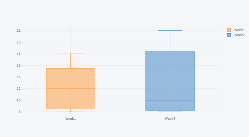
The sale of electric bulb on different days of a week is shown below,
| days | number of electric bulbs (Week 1) | number of electric bulbs (Week 2) |
|---|---|---|
| Monday | 12 | 10 |
| Tuesday | 16 | 8 |
| Wednesday | 8 | 14 |
| Thursday | 10 | 9 |
| Friday | 14 | 8 |
| Saturday | 8 | 20 |
| Sunday | 18 | 22 |
Represent the above data with the help of box plot for week1 and week2
sales = pd.DataFrame({'Days':['Monday','Tuesday','Wednesday','Thursday','Friday','Saturday','Sunday'],
                     'Week1':[12,16,8,10,14,8,18],
                     'Week2':[10,8,14,9,8,20,22]}
                    )
sales[['Week1','Week2']].iplot(kind='box')
Specify the column names on which to draw box plot
Scatter plots
Draw on two Quantitative variables
data= pd.read_csv("F:/Advanced Python/Module - 3/Dataset/iris.csv")
data.iplot(kind="scatter", theme="pearl",x="Sepal Length",y="Petal Length",
            categories="Class",xTitle="Sepal Length", yTitle="Petal Length", title="Scatter on Class")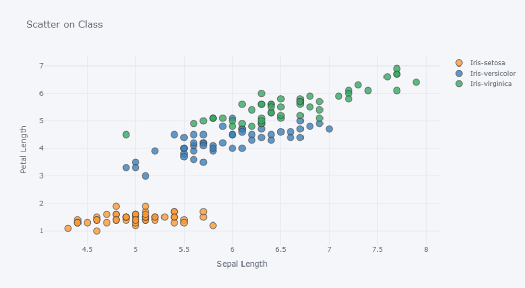

Bar Plot
In tips data set, plot the bar of how many smokers are male and female. Similarly how many non smokers are male ad female.
data1= pd.read_csv("F:/SRIHER/2021-2022/Quarter - 3/Advanced Python/Module - 3/Dataset/tips.csv")
data1| total_bill | tip | sex | smoker | day | time | size | |
| 0 | 16.99 | 1.01 | Female | No | Sun | Dinner | 2 |
| 1 | 10.34 | 1.66 | Male | No | Sun | Dinner | 3 |
| 2 | 21.01 | 3.5 | Male | No | Sun | Dinner | 3 |
| 3 | 23.68 | 3.31 | Male | No | Sun | Dinner | 2 |
| 4 | 24.59 | 3.61 | Female | No | Sun | Dinner | 4 |
| … | … | … | … | … | … | … | … |
| 239 | 29.03 | 5.92 | Male | No | Sat | Dinner | 3 |
| 240 | 27.18 | 2 | Female | Yes | Sat | Dinner | 2 |
| 241 | 22.67 | 2 | Male | Yes | Sat | Dinner | 2 |
| 242 | 17.82 | 1.75 | Male | No | Sat | Dinner | 2 |
| 243 | 18.78 | 3 | Female | No | Thur | Dinner | 2 |
smoker_sex = data1[data1['smoker']=='Yes']['sex'].value_counts()
nonsmoker_sex = data1[data1['smoker']=='No']['sex'].value_counts()
data2 = pd.DataFrame([smoker_sex,nonsmoker_sex])
data2.index = ['Smoker','Non Smoker']
data2.iplot(kind='bar', title='Habit of Smoking by the Sex')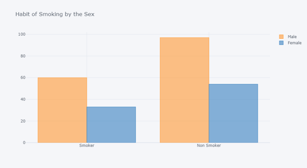
Pie chart
The colours preferred by the group of people are,
| Colours | Number of people |
|---|---|
| blue | 12 |
| green | 16 |
| yellow | 8 |
| Orange | 10 |
| red | 14 |
Represent the above data with the help of pie plot
import plotly.express as px

fav = pd.DataFrame({'Colours':['blue','green','yellow','Orange','red'],
                     'Number of people':[12,16,8,10,14,]
                    })
fig = px.pie(fav,values="Number of people",names="Colours",
             title='Favourite color of the people')
fig.show()

#fav.iplot(kind='pie', title='Favourite color of the people',values=fav['Number of people'],labels='Colours')
#pl.pie(values=fav['Number of people'],labels='Colours')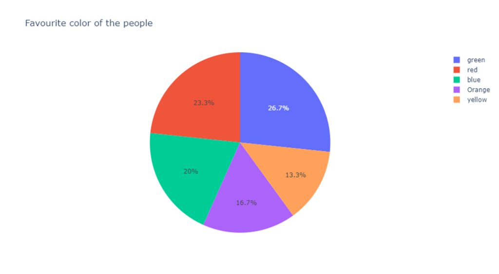
Views: 2